2026
Tools Used: Adobe Illustrator | Figma
Project Type: School
Tools Used: Adobe Illustrator | Figma
Project Type: School
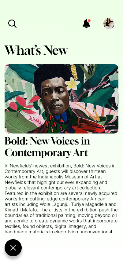
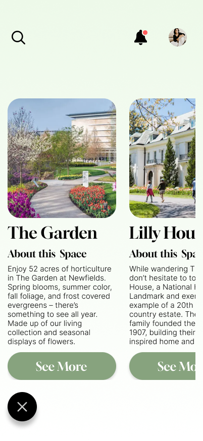
Newfields is a an art museum located in Indianapolis, Indiana that blends art with nature. The museum app is aimed at helping visitors interact with the main art museum and the other spaces located in the complex such as the gardens.
PROCESS
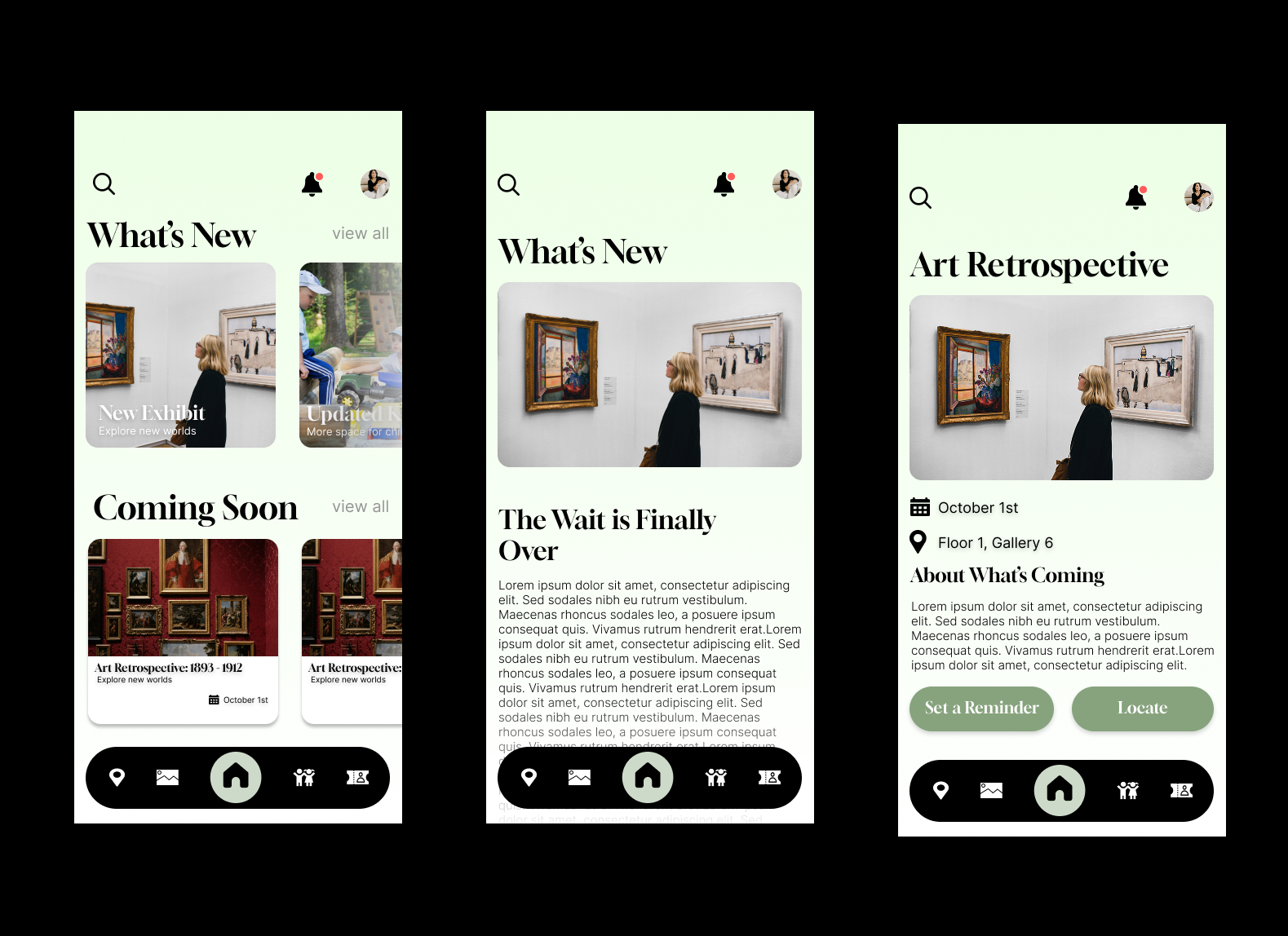
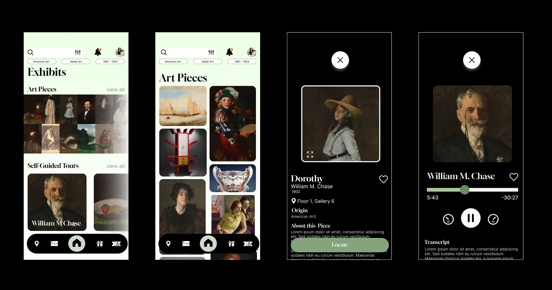
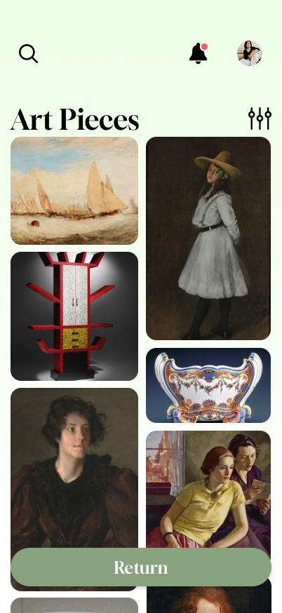
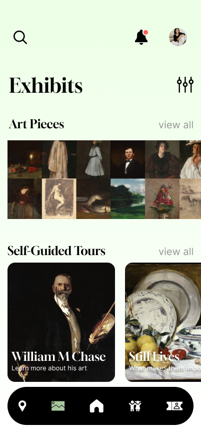
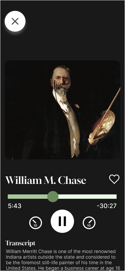
When designing my app I had to keep in mind I had to address four needs users would have: (1) staying informed on what's happening at the museum, (2) exploring art, (3) engaging younger audiences, and (4) planning visits.
PHASE ONE
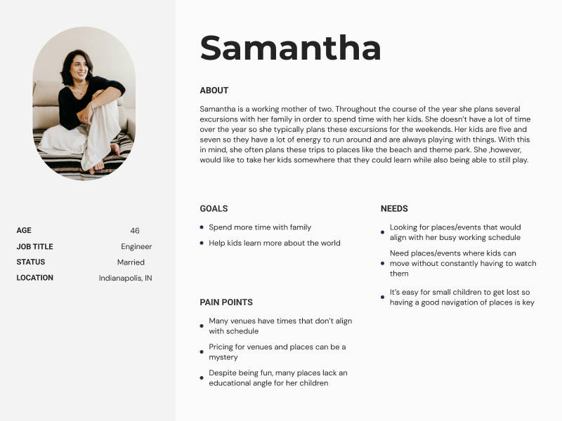
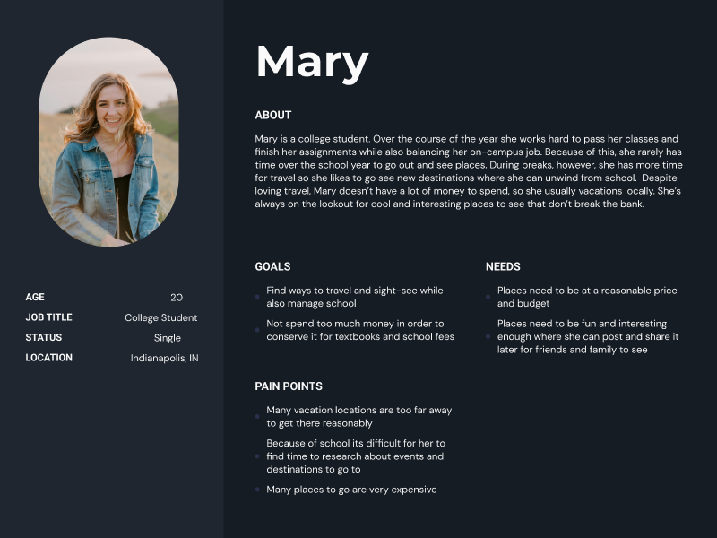
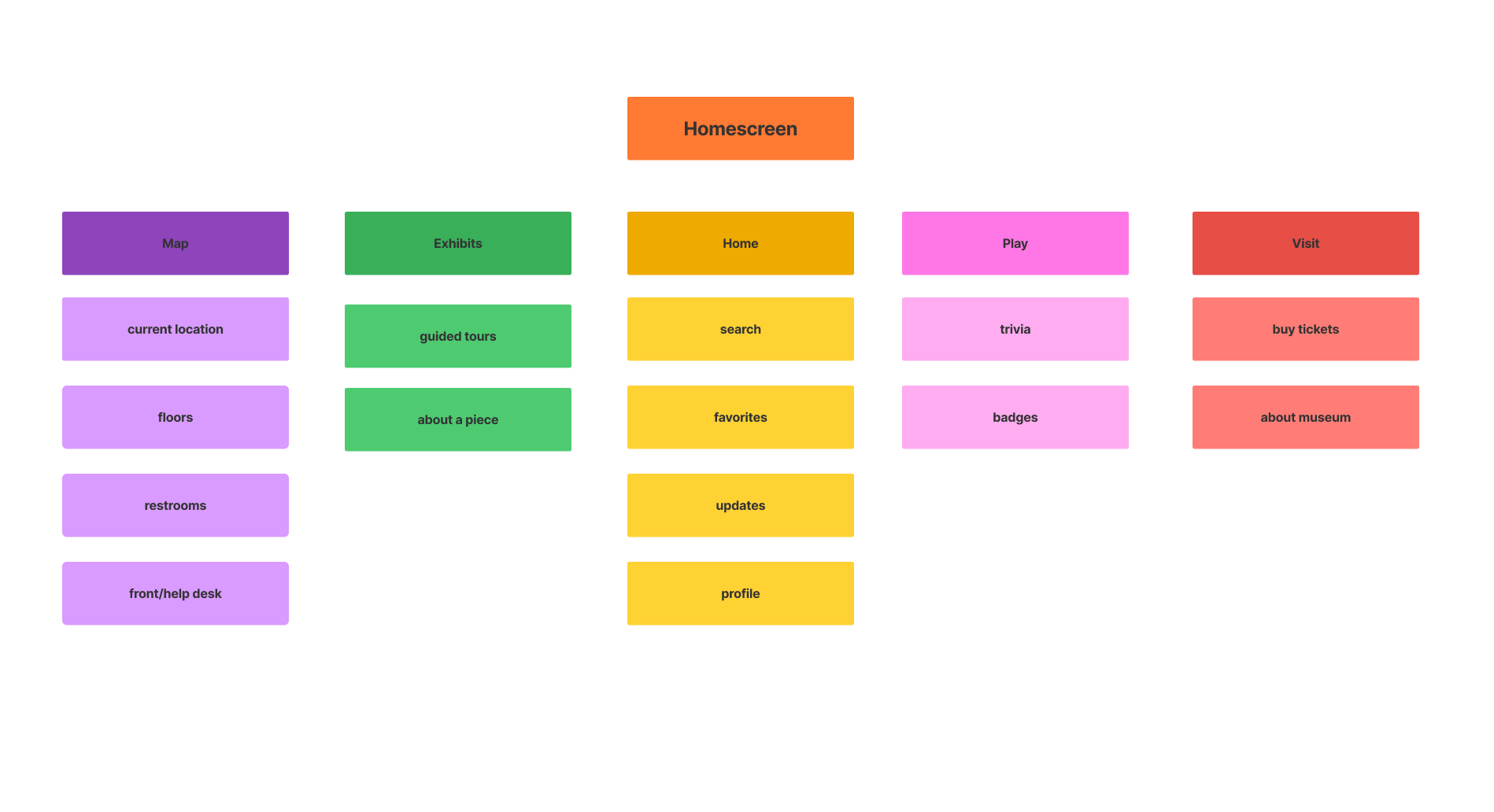
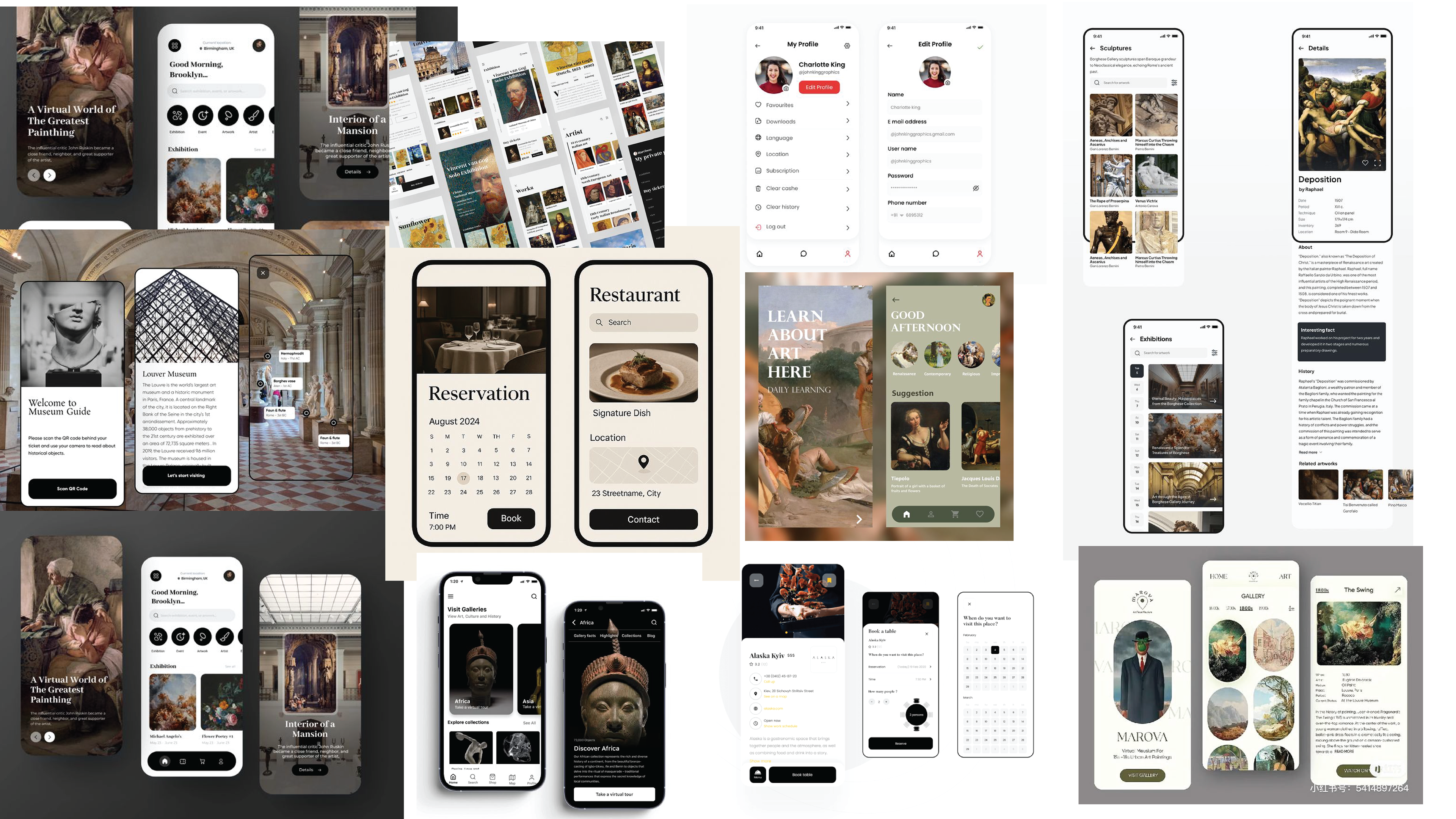
First, I started by gathering information about the museum, such as its key differentiating points from other museums, what it struggled with, and apps I could reference to base my design on. I crafted two different user personas and defined what they would both need from the app, which helped determine how the information architecture should be structured and what each page of the app should include to address these needs.
First, I started by gathering information about the museum, such as its key differentiating points from other museums, what it struggled with, and apps I could reference to base my design on. I crafted two different user personas and defined what they would both need from the app, which helped determine how the information architecture should be structured and what each page of the app should include to address these needs.
USER PERSONAS
INFORMATION ARCHITECTURE
MOODBOARD
PHASE TWO
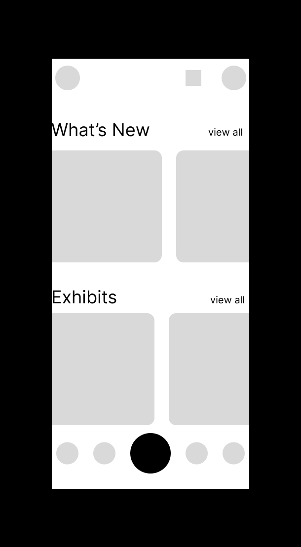
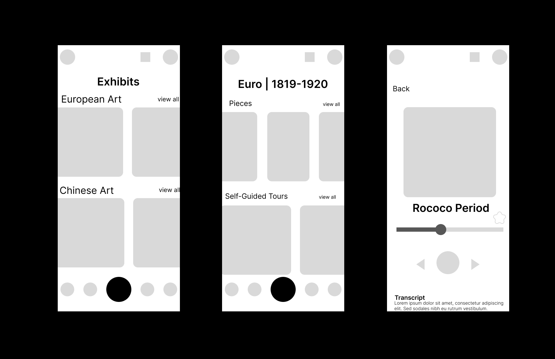
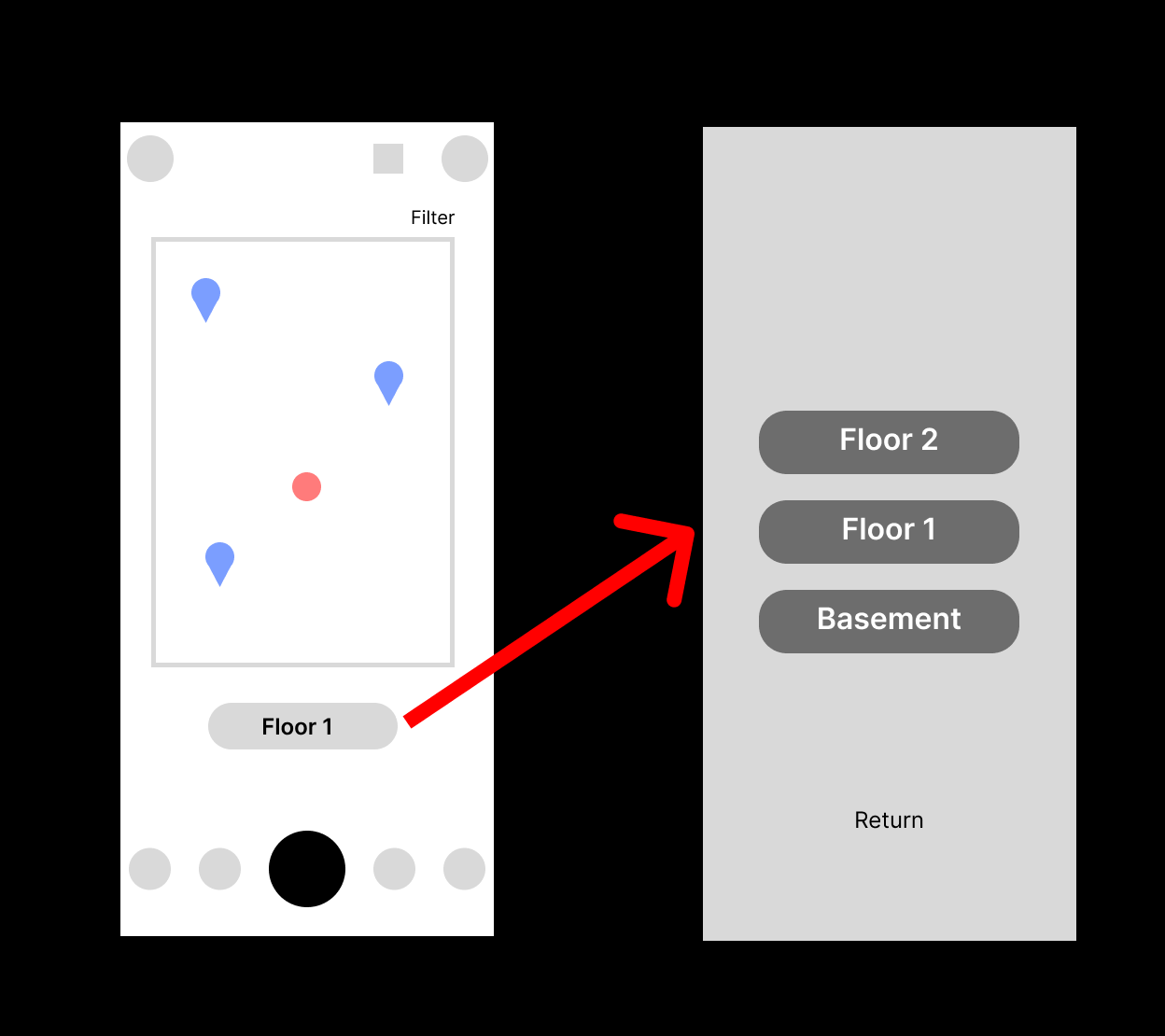
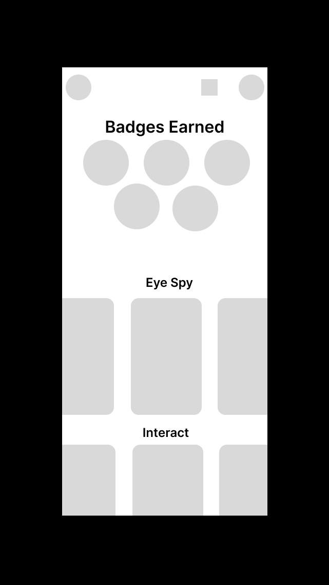
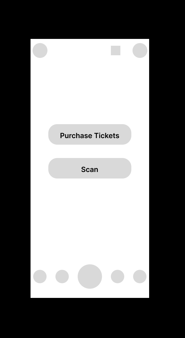
For phase two, I focused on making a bare bones template of the main pages of each page and general information each section needed to have, not getting too into specifics for each.
For phase two, I focused on making a bare bones template of the main pages of each page and general information each section needed to have, not getting too into specifics for each.
HOME
EXHIBITS
MAP
PLAY
VISIT
PHASE THREE
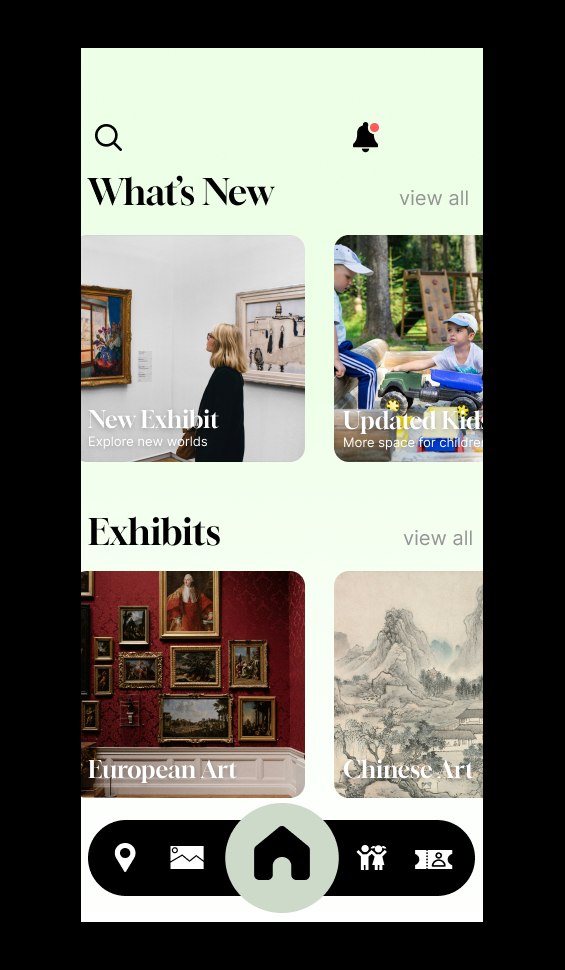
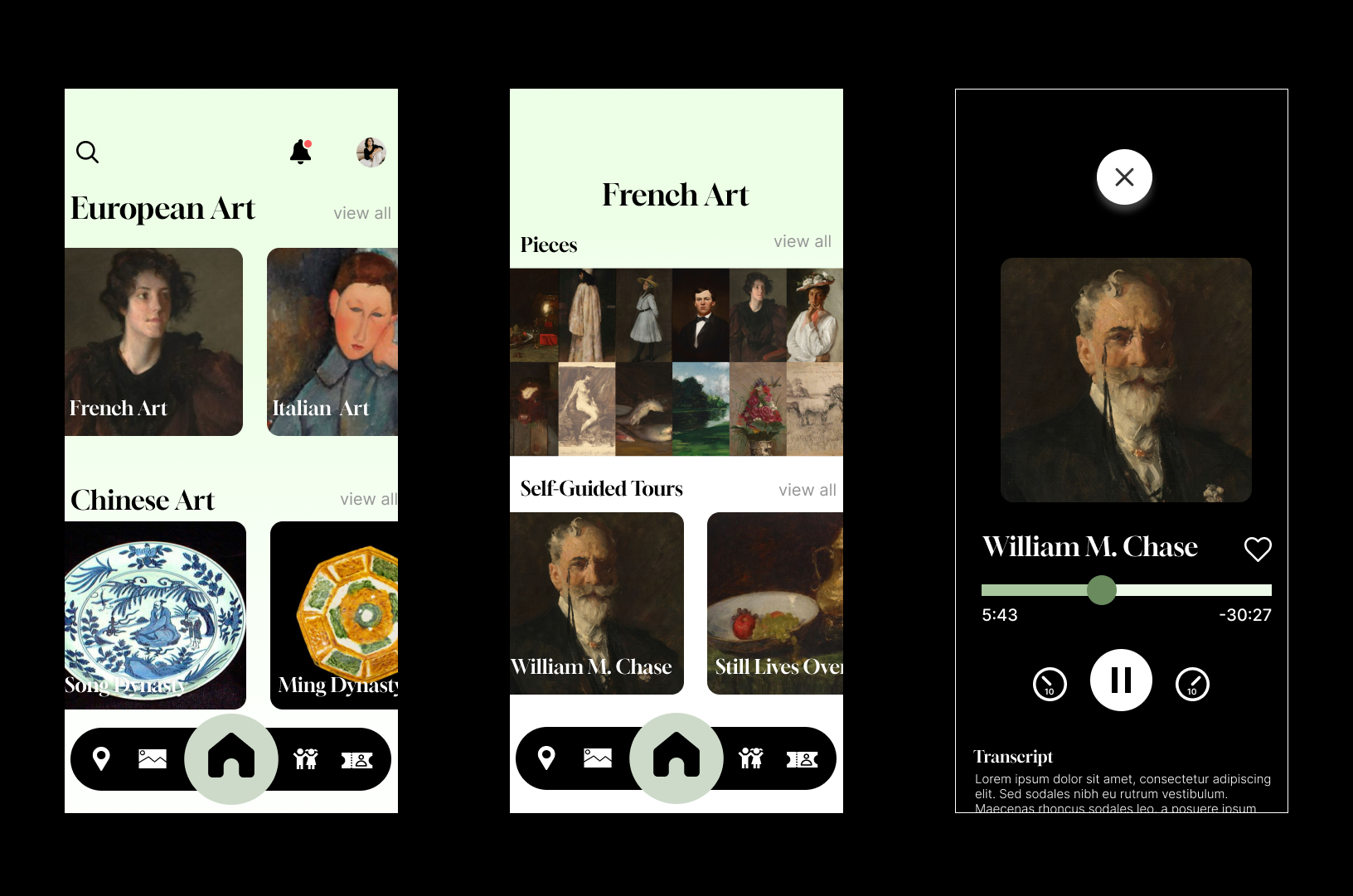
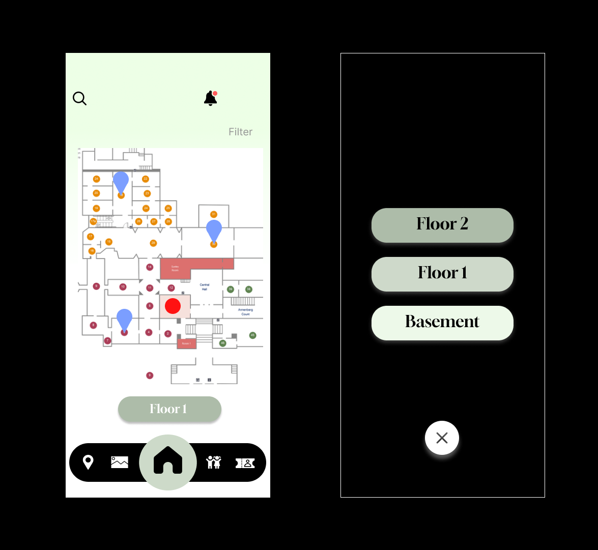
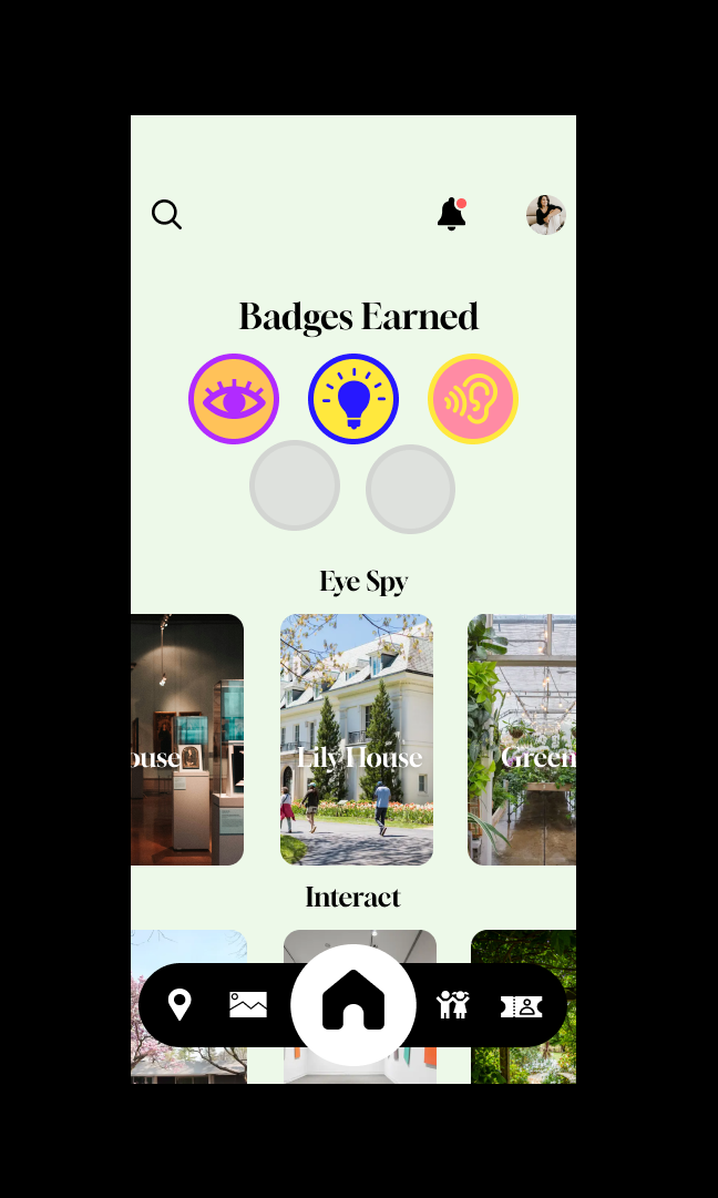
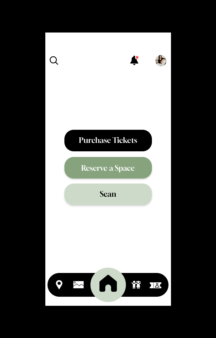
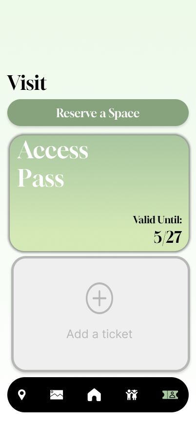
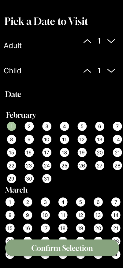
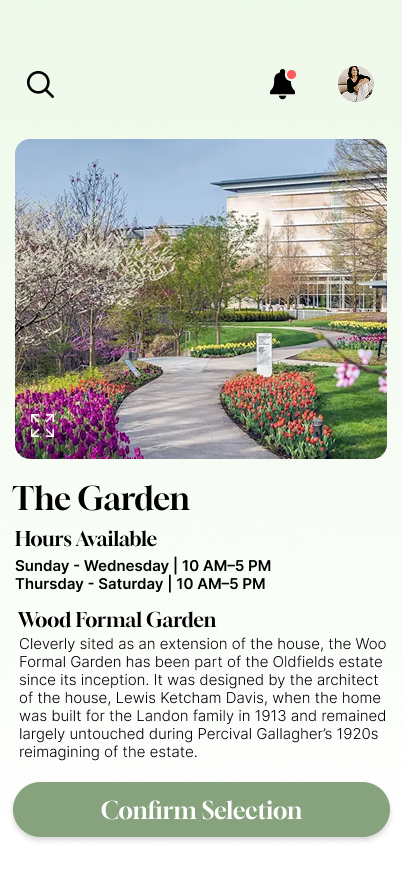
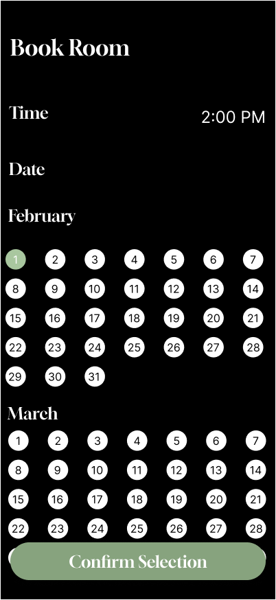
When I began translating the design into high-fidelity frames with color, I realized my app design did not address one user need well: planning visits. In my second iteration, I expanded on ways visitors could schedule visits and reserve specific museum areas or rooms. I also received feedback from my instructor to simplify the UI and make it more understandable. This pushed me to move away from using only simple buttons on that page.
When I began translating the design into high-fidelity frames with color, I realized my app design did not address one user need well: planning visits. In my second iteration, I expanded on ways visitors could schedule visits and reserve specific museum areas or rooms. I also received feedback from my instructor to simplify the UI and make it more understandable. This pushed me to move away from using only simple buttons on that page.
ITERATION 1
ITERATION 2
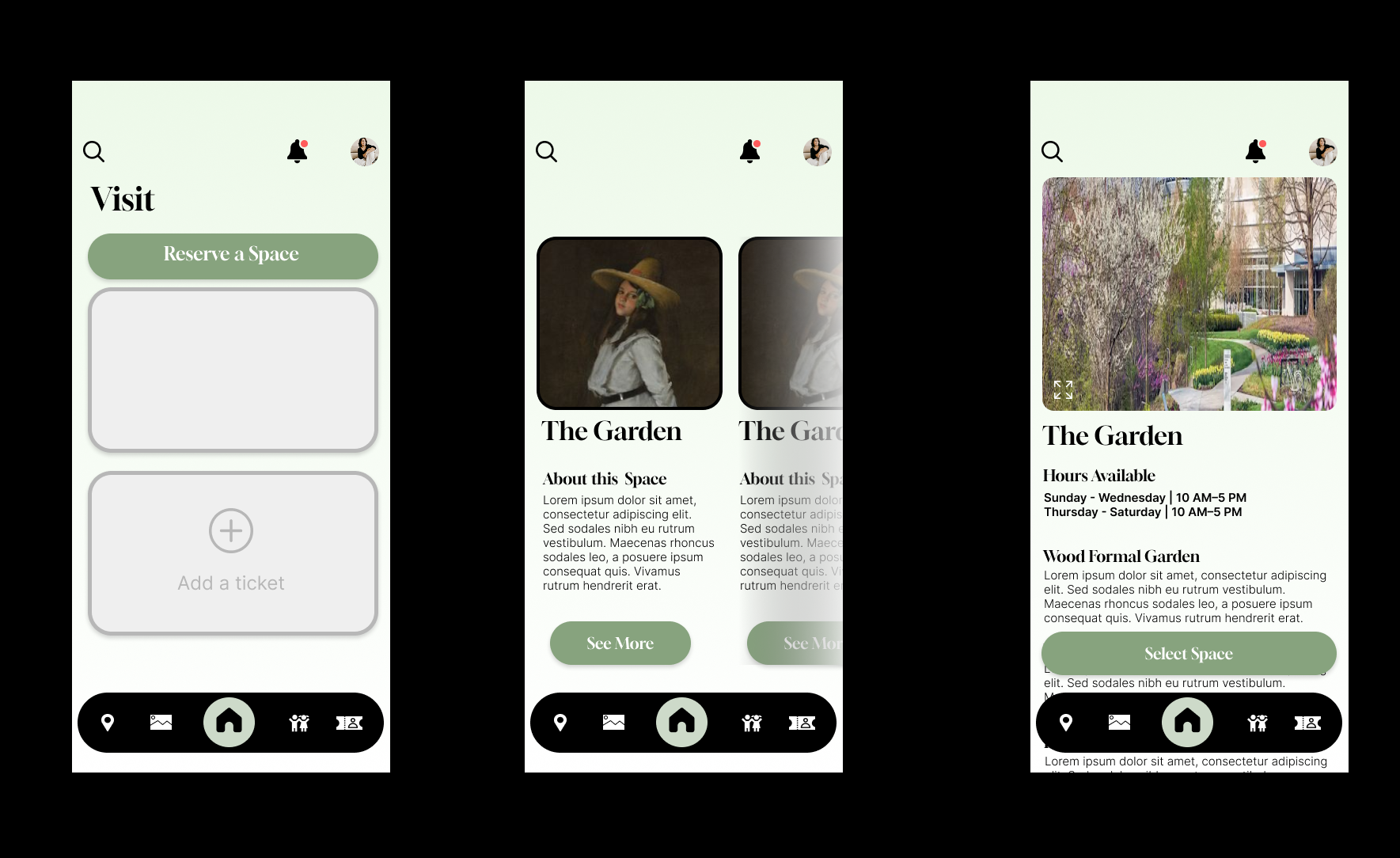
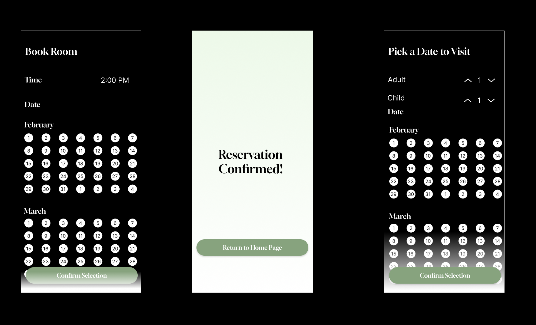
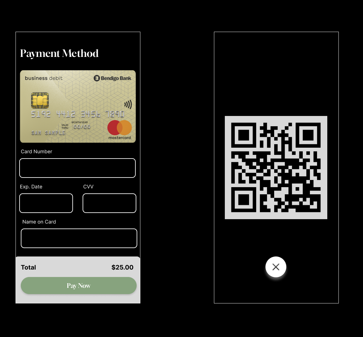
VISUAL IDENTITY
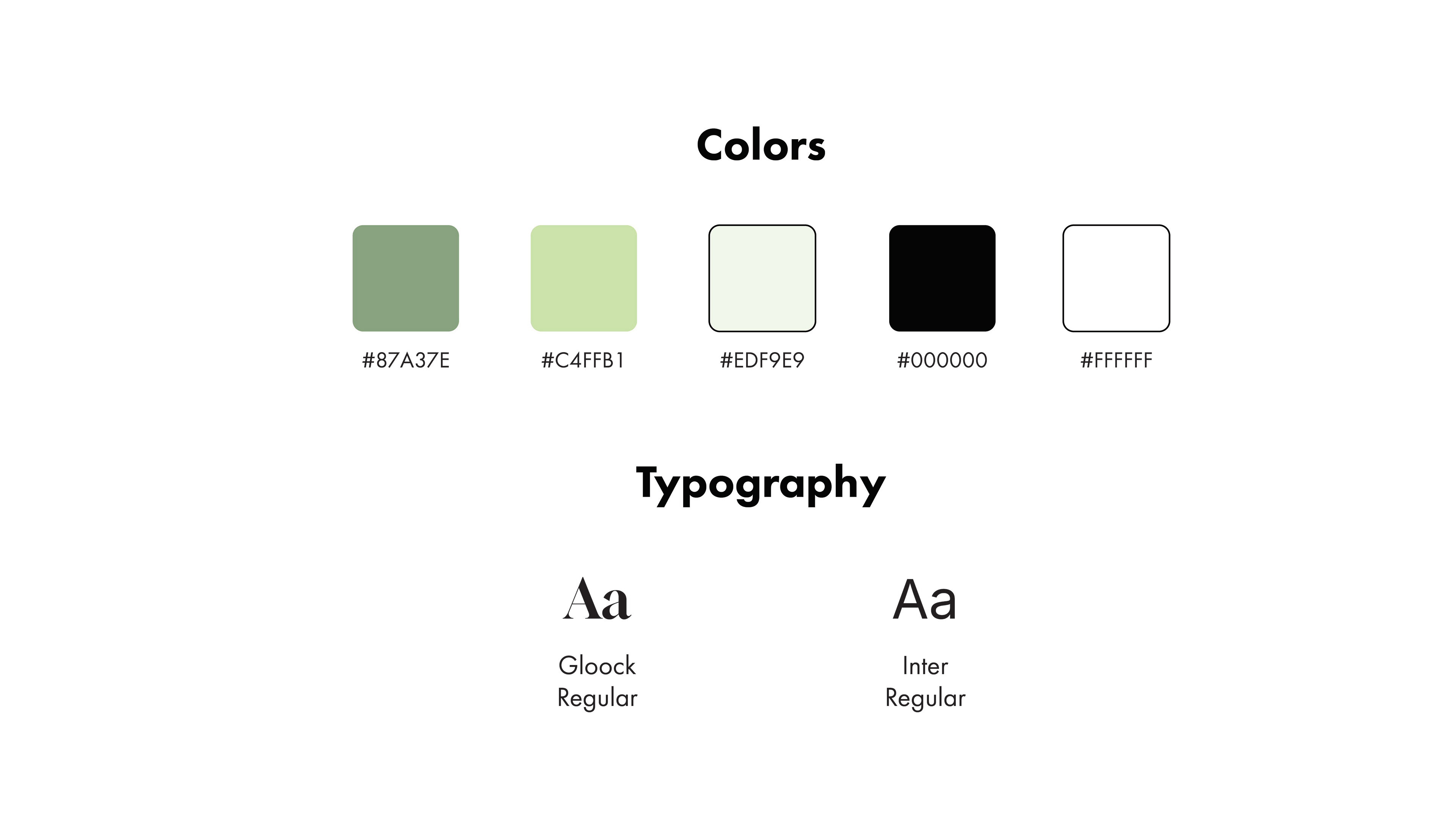
FINAL DESIGN
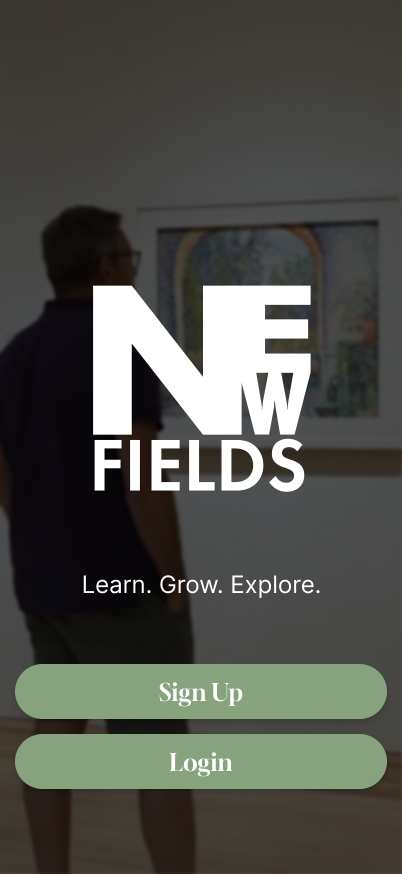
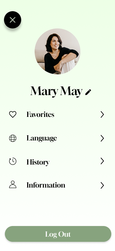
LOGIN + PROFILE
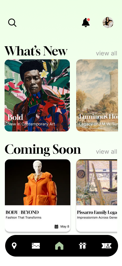
HOME
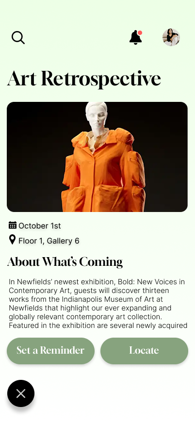
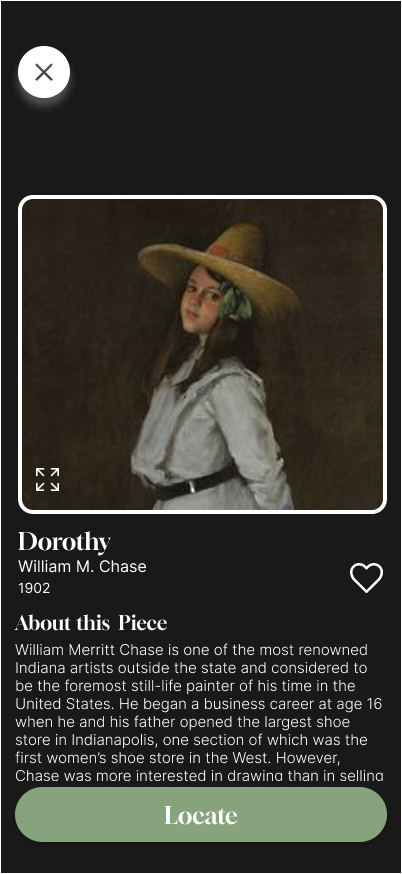
EXHIBITS
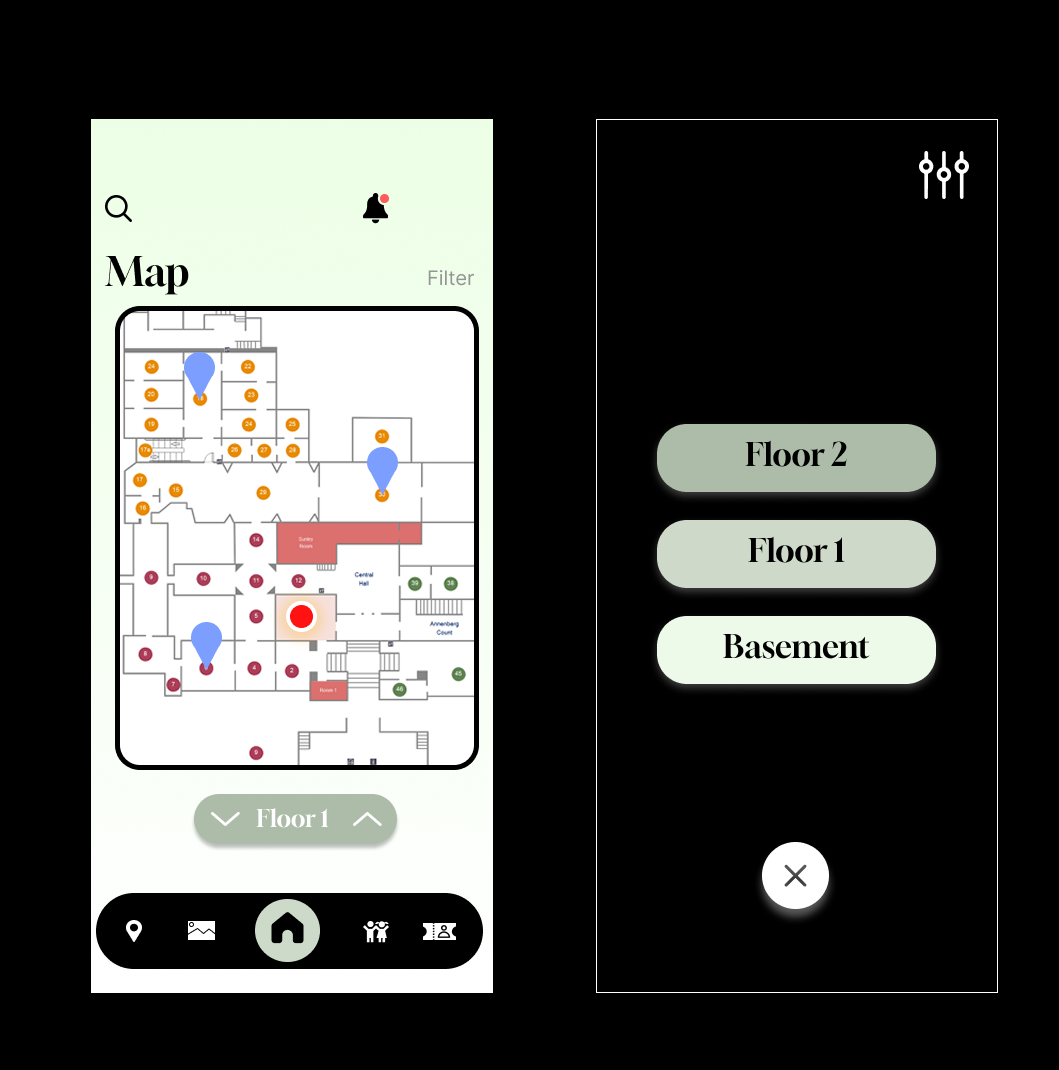
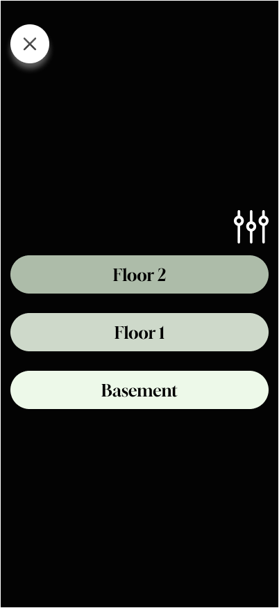
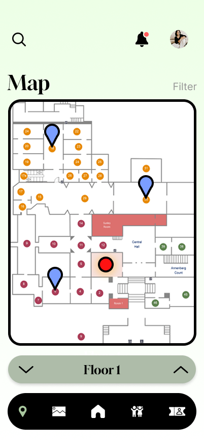
MAP
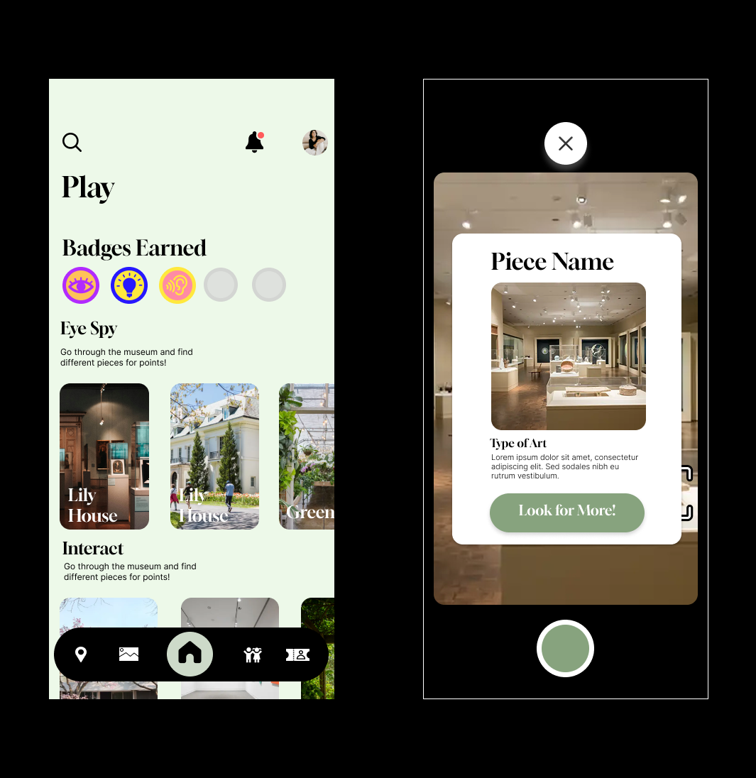
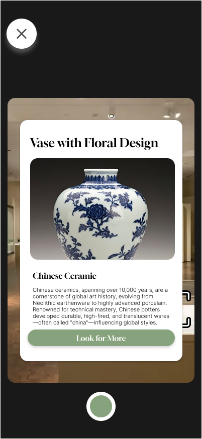
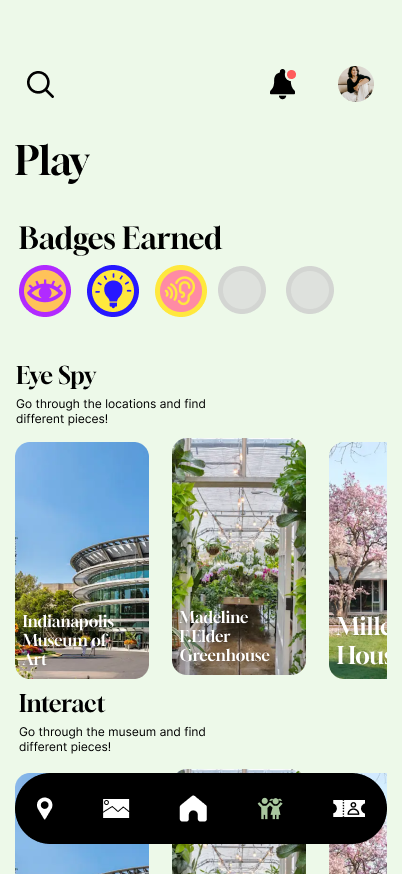
PLAY
VISIT
WALKTHROUGH VIDEO